Developing the internet into an oversized information apparatus can be seen in design innovations that have changed the appearance of the world wide web over the years. Above all, the mobile revolution forced web designers to radically rethink.
Today, they are supposed to showcase the internet on the smallest of screens without withholding valuable information. But even on a more specific web design level, new trends can be seen over and over again, which already show us what the internet of tomorrow will be like. We present 8 of these trends so that you can prepare yourself for modern web design in 2019.
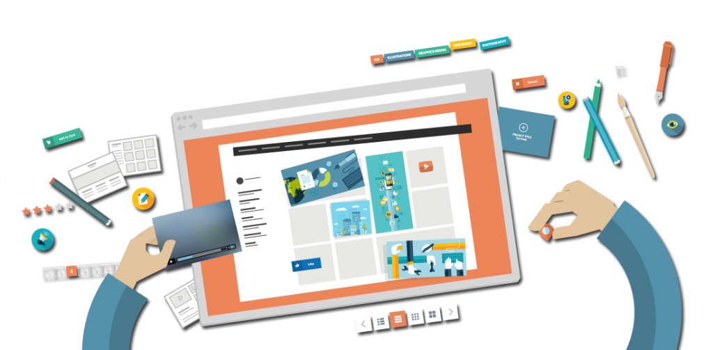
What does web design mean in 2019?
First of all, some developments can be observed that are based on mobile adaptations of recent years. Websites should become even more efficient and user-friendly in order to keep up with the competitive online market, whether on a PC, a tablet, or a smartphone. The bulky and slightly overloaded designs of the 2000s have long been a thing of the past; the human eye is fed up with them now. The new idea now is to concentrate on the essentials.
The keyword is “usability” when it comes to websites. Responsive web design is an important trend for the mobile market. It emphasizes technical flexibility while also taking the user’s device into account. Modern web design therefore means that a website “reacts” effectively to the user’s device and presents itself accordingly. Responsive web design is consciously designed so that websites can react well to new or previously unfamiliar systems. Web designers no longer just develop for browsers anymore – many of the best-known website providers enable easier mobile use via their own apps.
Some web design buzzwords will follow us into 2019. On the one hand, there is the Internet of Things, which sees an increasing digitalization of everyday life and wants to offer users even more interaction possibilities. On the other hand, there have been significant advances in AI research resulting in automated web services becoming better and better; web designers are likely to try to fully exploit this area as well.
Last, but not least, the increasing focus on snackable content means that web operators try to make their websites as catchy as possible and make sure that user-friendliness is a top priority. At the same time, these digital “appetizers” show a trend dating back to the bright and attention-grabbing vision of the 2000s. If these two trends – focusing on usability and snackable content – actually work together and other innovation and courageous ideas catch on, 2019 should be an exciting year for web designers.
Trends and counter-trends in web design
Web design trends aren’t the only trends; there are also other trends that lead particular design elements in a different or even totally opposite direction. Sometimes counter-trends develop from a reaction to certain trends when they become more and more apparent. Web designers often rely on counter-trends in order to stand out straightaway in the internet landscape of the future. Here are some examples of trends and corresponding counter-trends that we will encounter in 2019.
8 trends that will influence web design in 2019
Overall, web design continues to evolve in the same direction that it has for years: increasing attention to mobile devices (responsive web design), easily consumable content, purpose-driven interfaces, and reactive or interactive user interfaces. At the same time, developments in artificial intelligence have an increasing impact on web designers and new technologies are becoming more accessible. 2019 will see the continuation of various web design trends from previous years and the internet landscape will not radically change. However, some trends indicate further improvement when it comes to user experience on platforms and will help shape the internet of tomorrow today.
Trend 1: Speed/performance is becoming more important
This is less like a trend than a basic principle of a well-designed website: Speed is becoming more and more important. This is partly due to the mobile revolution; after all, website operators want their pages to be easy to access and space-saving. The faster the website loads, the better the user experience – this was at least the case ten years ago. Nevertheless, a trend can be observed that web designers are increasingly foregoing time-consuming and memory-intensive elements in order to enable faster use of the website.
Many other trends in web design start here. For example, the increasing minimalism in website design means that memory-intensive media is largely avoided and formats that don’t take up as much storage are preferred. “Long scrolling” websites, which place all necessary information on a single scrollable page, are favorable here since the user only has to load this one page and not several sub-pages afterwards. The increasingly popular “white space” also signifies the absence of elements that could slow down a website’s loading speed.
The internet has become faster and faster in its relatively short development period. But it is still often criticized for not being fast enough. Mobile data networks in particular are not yet powerful enough in many regions. Web designers, however, can already counteract shortcomings like these by designing their websites as simply as possible.
Other trends of modern web design such as interactive animations, parallax effects, or a dynamic background looks impressive and improve the intake of information, if used effectively. However, complex website design often has a negative effect on performance. Web designers must therefore carefully consider which multimedia and interactive content offers added value for the user and which unnecessarily slows the website down. The general rule is: less is more – which does not necessarily mean returning to flat design.
Note: a website’s performance has a direct effect on user experience. A distinction must be made between actual and perceived loading time. Delays are only problematic if they are perceived as such by the user. Web designers therefore use the following measures, among others, to intercept longer loading times:
Progress indicator
If the visitor has to wait, they should at least know how long for. The progress bar doesn’t shorten the loading time, but it can at least make it more entertaining if it is designed in an interesting way. The aim is to keep the user on the site even if they are made to wait. After all, internet users today are becoming more and more impatient when it comes to accessing websites.
Load key elements first
Web pages should be programmed so that “above the fold” content is retrieved first and displayed in the browser. These are the parts of the page that are visible to the viewer without them having to scroll down. As long as this content is available, it doesn’t matter to the user whether additional content (“below the fold”) is loaded later.
Progressive JPEGs
Images embedded as progressive JPEGs do not build up from top to bottom in the final resolution when loaded. Instead, interlaced scanning is used: the viewer is first presented with a preview image that’s low quality, which is gradually refined until the data for the desired image quality has been completely loaded. Tip
In summary, the same applies to videos, photos, and gimmicks of all kinds just as it does for content: they should be of high quality, unique, and relevant to the user. In addition, it makes sense that content like this is only loaded when the visitor accesses it. Mobile device users or weaker internet connections in particular benefit from well-structured websites that are free of unnecessary data burdens.
Trend 2: Dynamic background elements
On the internet, there are stock photos as far as the eye can see. Website operators have made it especially easy in the last few years. Instead of creating your own images, the comparatively cost-effective buying of stock photos is now standard practice although it isn’t very original. These images break up text to make the website more exciting and less tedious to read.
The main problem of popular stock photos is implied in their very name: they are available to everyone. These photos can most likely be found all over the web and do little to generate extra attention. For this reason, one of the significant web design trends in 2019 is to use as many high quality, dynamic background images and videos as possible.
Dynamic background elements give website creators the ability to convey information faster and more directly than with text elements. In addition, visitors can be addressed on an emotional level using photos, graphics, and videos. A dynamic background design is therefore often used with the hope of conjuring up feelings and putting the visitor in the right mood.
In order to protect your privacy, the video will not load until you click on it.
Trend 3: Microinteractions
Microinteractions is a trend in UX design where selected user interactions are accompanied by small animation effects.
In order to protect your privacy, the video will not load until you click on it.
Trend 4: Long/infinite scrolling
The slogan “mobile first” applies not only to viewports and the lossless depiction of web content across different devices. The trend towards mobile devices will have an increasing influence on web content in the future. One of the most important developments in this context is the transition from click to scrolling. In principle, the scrolling website is an old friend. However, design concepts such as infinite scrolling or the parallax effect continue to enjoy great popularity and will therefore remain in trend in 2019.
Infinite scrolling
Infinite scrolling enables website visitors to discover new content by scrolling, rather than clicking. When the end of a section has been reached, the next part is automatically shown. Social networks, like Facebook, Instagram, Reddit, and Quora, have long since employed this method to present their users with content in a continual newsfeed. Infinite scrolling has also been a common tool used in blogs for some time now and is sure to play a large role in the future.
Infinite scrolling is ideal for websites with a wide range of information. While a blog with 100 to 200 posts can still be easily paginated, the benefits of page splitting on large web projects decreases as the amount of information increases. It’s unlikely for a reader to search for page 812 from a total of 5782 pages, for example. Infinite scrolling on the other hand, is typically used with sophisticated algorithms that pre-filter information and present users with the most relevant blog posts first.
Website operators, who want to jump on the infinite scrolling bandwagon in 2019, should, however, make sure they do so in a search engine-friendly way. While Google initially struggled with crawling scroll websites, infinite scrolling can now be implemented without worry thanks to detailed design guidelines from the search engine market leader. Take the following points into consideration:
- Individual URL for every subpage
- Overlapping content should be strictly avoided
- Visitors should be able to easily locate the sought-after information
- Loading time should be reasonable
Parallax scrolling effect
Although parallax scrolling may not belong to the newest web design trends, the next years will still prove to be important for the increasingly popular function. This motion parallax has been an essential building block for modern websites over the past few years. The special ability to move various levels of a website at different speeds creates depth perception. These special visual effects keep the fascinated visitor scrolling and, as a result, they stay on the page longer. These effects are ideally combined with elements that prompt the visitor to carry out a desired action. For this reason, parallax scrolling is an excellent feature to use in tandem with interactive storytelling.
Trend 5: Personalized user experience
Targeted presentation of web content is one of the basic principles of modern web design. Especially in e-commerce, the selection of content and its presentation should be based on the requirements of potential customers. In the past, the focus was on abstract groups of people, but in 2019, the focus will be on user experience.
While functions such as “Pages you may like” are used by practically every online store, some companies are taking it a step further and are customizing their products to each user. The music streaming service, Spotify, and the Netflix video-on-demand portal are examples of companies tailoring their services to customers. This means that two users almost never see the same selection of individualized products on the respective website.
A web design trend of 2019 will be personalized websites where visitors see content that matches their usage habits. Web analysis tools such as Google Analytics and Piwik provide the foundations for personalized UI. They give content providers a comprehensive picture of how web users interact with web content.
Trend 6: GIFs
The small moving images that run in a continuous loop have been experiencing a surprising rebirth since 2018. They have withstood new, much more powerful formats such as WebM and can be found mainly on many communication platforms. The advantages are obvious: First, GIF files are relatively small; in addition, they play automatically so that they don’t affect the seamless user experience. Unlike WebM videos and many other moving formats, GIFs can be played without sound and are less intrusive.
Various GIF libraries such as Giphy, which enable you to integrate GIFs anywhere, have played a major role in the uprisal of GIFs. These libraries offer an incredibly large selection so that almost every user can find a suitable GIF from a variety of sources. So it is not surprising that these GIFs are helping the meme culture flourish. In 2019, online communication will again take place not only via text and emojis, but also via GIFs that can be used in many different ways.
Trend 7: Chatbots
Communication programs are nothing new. Chatbots originate from the research area of Artificial Intelligence (AI) and are already used nowadays on corporate websites or in online stores. Usually, these are small dialog boxes that accept user questions and automatically generate responses. The machine’s learning algorithm creates personalized answers, which gives the user the impression that they are speaking with a human. Chatbots are used as virtual shopping assistants or as an alternative to the classic FAQ section.
Chatbots are rarely intrusive, but are usually operated via small interactive elements. The user therefore gets the impression that they are being contacted in real-time by an employee of the web service. In most cases, the user is able to respond to the request without leaving the website. The distrust of AI-controlled dialog partners has probably subsided somewhat since the success of Siri, Alexa, Cortana, etc. In most cases, however, chatbots are (still) nothing more than search bars that react more dynamically to search queries. It will be interesting to see how chatbots further develop in 2019.
Trend 8: Tidy interface
Well-planned layouts are often copied and this can be seen in web design trends. The user interfaces of many websites and web apps are increasingly based on proven practices in the design and arrangement of content. The layout always influences a website’s user-friendliness.
Basically, you can’t go wrong with a tidy user interface (UI). Likewise, you can stick to the long-established portal design for extensive websites or to the blog design for smaller websites and know it will work since these designs have been tried and tested. On the other hand, there have been two more recent layout trends in web design, which will be found on many graphical user interfaces in 2019.
Hamburger button
This phenomenon has established itself so quickly that many users already take it for granted in their menu layout: the small menu button, also known as the “hamburger button”. Initially, it was mainly used for drop-down menus on mobile websites and apps. In the meantime, however, the symbol is also used as the menu button on many desktop versions. The symbol looks like a layered burger and is often presented by the mathematical symbol “≡”, which means “identical”.
Card layouts
The second, more recent web design trend affects how content is presented. Card layouts (also known as “card-based design”) are being used more and more frequently. Here, text and/or image-based content or “call to action” buttons are presented in several boxes that are distributed over the user interface.
This offers several advantages: in addition to the many ways it enables a website to be clearly and visually presented, the card layout is also advantageous from a pragmatic point of view: since the individual boxes or cards act as containers for web content, they can be easily moved within the website design grid. Redistributing site content is made a lot easier with a responsive web layout. The card layout became especially popular mainly through various image platforms such as Pinterest or web design platforms like Dribbble.
Web design trends: a path to success
The web design trends for 2018 are all about interactivity. Additionally, websites should be made even more user-friendly in the future and be quicker for users to access. Web content is not separately tailored to different devices, but is optimized with responsive design so it can be properly displayed on all devices.
Parallax and infinite scrolling are popular styling tools that should accompany the visitor while they navigate through the website. These are also required for the interactive storytelling trend where the customer receives the desired information presented in a short story. Hand-drawn illustrations, premium background elements, and individual fonts all provide websites with a personal touch. It is more important than ever to personally address website visitors. A user-friendly website that attractively presents quality content is the first step for online success.
If you’re building your own website or would like to update your existing site you should take inspiration from the 2019 web design trends. This is how you prepare your website for the requirements and expectations of tomorrow.